Color
We use color to signal that we’re a proud member of the Cornell University family—and also to cast the ILR School in a distinctive light.
Primary Palette
Color
The primary color palette takes its cue from the University’s main brand colors, reinforcing a strong visual connection to Cornell.
Follow these color specifications and avoid using large fields of color, opting instead for a generous amount of clear space. Think about white as the primary color, black for typography and graphic elements, and Carnellian red for accents. Allow photography to lend vibrancy to our communications.

CMYK (0/0/0/0)
HEX #FFFFFF

CMYK (0/100/79/20)
HEX #B31B1B

CMYK (0/0/0/100)
HEX #222222
Secondary Palette
Color
Our secondary colors are drawn from the University’s secondary color palette. They are meant to accent the primary color palette.
Use them sparingly and thoughtfully—for most cases the primary colors will be all we need.

CMYK (0/90/60/0)
HEX #EF4035

CMYK (100/62/12/62)
HEX #073949

CMYK (20/3/38/8)
HEX #C9D6A5

CMYK (14/9/51/25)
HEX #BFB778

CMYK (29/8/25/24)
HEX #9FAD9F

CMYK (14/18/22/42)
HEX #A2998B

CMYK (6/7/9/15)
HEX #D8D2C9
Typography
The way we use type embodies our personality. ILR is a meeting ground where people with diverse perspectives and methods can collaborate. Reflecting that, we use two distinct typefaces and juxtapose them to create bold statements and tell our stories with confidence.
Primary Typeface
Typography
Replica is ILR’s primary typeface. It is featured in the wordmark and should be used in all visual assets, both printed and on screen.
Replica is a contemporary sans serif designed by Dimitri Bruni and Manuel Krebs. The design is inspired by the classic sans-serif grotesques widely used in the 1950s, the formative years of ILR’s history.
It’s built around a strict grid that gives it a geometric feel and a unique shape to its terminals. These beveled forms are the starting point for the open frame—the primary graphic element of ILR’s graphic identity (see below).

Open Source Font
Typography
Due to restrictions in the license for Replica as our primary font, we recommend using Roboto, a free, open-source font available to download from Google Fonts. We recommend using Roboto Thin for body text.
In some platforms (MailChimp, Vertical Response, landing page tools, etc) Roboto will be freely available and already installed. To use it on your computer for design applications or in MS Word, download and install the font.
In some cases you may choose to use an already installed system font. We recommend using Arial when you do not have access to brand fonts.
Secondary Typeface
Typography
Use Futura Extra Black in all caps for headlines. An ideal use would be to feature our tagline in Futura on a poster. Another example might be a bold, all-caps header on our homepage, or section subheaders on editorial content.
Futura is a geometric sans serif designed by Paul Renner and released in 1927. It is based on geometric shapes, especially the circle, similar in spirit to the Bauhaus design style of the same period.
Futura has an appearance of efficiency and forwardness. Renner believed that a modern typeface should express modern models, rather than be a revival of a previous design.

Open Source Secondary Font
Typography
The license to Futura Extra Black is more flexible, if you would like access, please contact us at ilrcommunications@cornell.edu.
In some cases, you may need to use an open source option for our secondary font. We recommend using Open Sans, available to download from Google Fonts. Use Open Sans Extra Bold in all caps for headlines.
In some platforms (MailChimp, Vertical Response, landing page tools, etc) Open Sans will be freely available and already installed. To use it on your computer for design applications or in MS Word, download and install the font.
In some cases you may choose to use an already installed system font. We recommend using Arial Black in all caps for headings when you do not have access to brand fonts.
Type Guidelines
Typography
Here are a few things to consider as we create print and digital assets.
- Use title case for both headlines and body copy. Limit uppercase typography only to big, bold headlines.
- Be playful with the rag on the main headlines—they should convey dynamism.
- Left-align text blocks whenever possible. Do not force justify text blocks.
- Deploy a meaningful limit to type sizes; don’t say with three sizes what we can say with two. Be consistent with type sizes for headers, body text, and captions in a document.
- Use type over an image only when all text is legible and passes our accessibility standards.
- Avoid embellishing type with drop-shadows, outlines, or noticeable photo darkening.
- Keep an ample amount of white space around text blocks and images—try not to crowd our compositions.
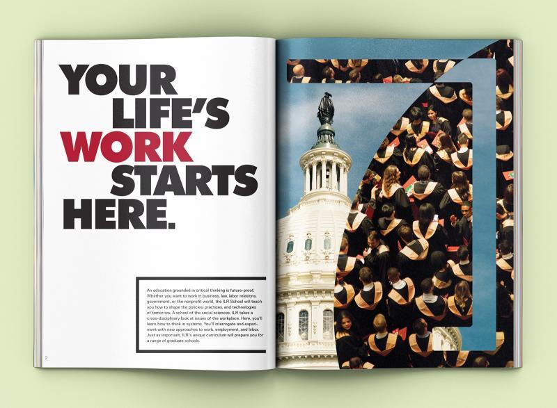
Type in Use
Typography
Sample spread